Class Discovery Redesign at Skillshare
Helping learners choose the right class with clearer cards, previews, and CTAs.
.png)
Context
As a Product Designer at Skillshare, I worked on improving the class discovery experience, a key step in learner activation and retention. We focused on making class cards more informative and usable so learners could confidently decide which class to take.
Team
Jayden Kang
1 PM
3 Engineers
1 PM
3 Engineers
Timeline
4 Weeks for Research + Design
Live on Skillshare Member Experience
Live on Skillshare Member Experience
Key Outcomes
+47% Subscriptions
in A/B Testing, resulting in full rollout
+5% Improved Click Through Rate
in A/B Testing, resulting in full rollout
Survey Design & Analysis
Created pre-design survey to identify information hierarchy.
Usability Testing
Designed and ran Maze test with 183 participants.
SUmmary to save you your time
tl;dr
Here’s a high level overview of the research and design process.
Please reach out to jaydehnajun@gmail.com for full case study.
Please reach out to jaydehnajun@gmail.com for full case study.
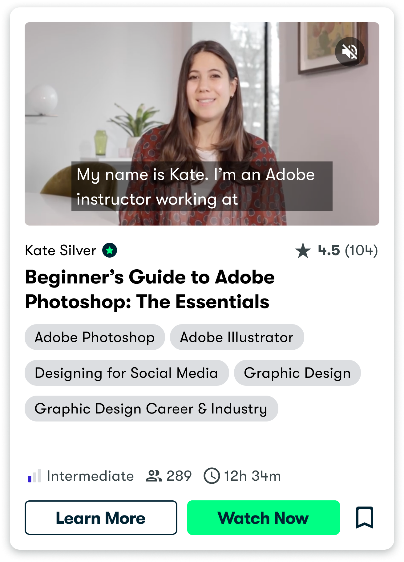
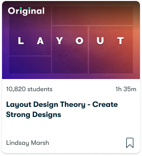
Problem
Users make layered decisions when choosing a class, but the current experience only supports a shallow flow: card → full class. Key info is buried, leading to drop-off, misclicks, and low start rates after saving.
User Interviews
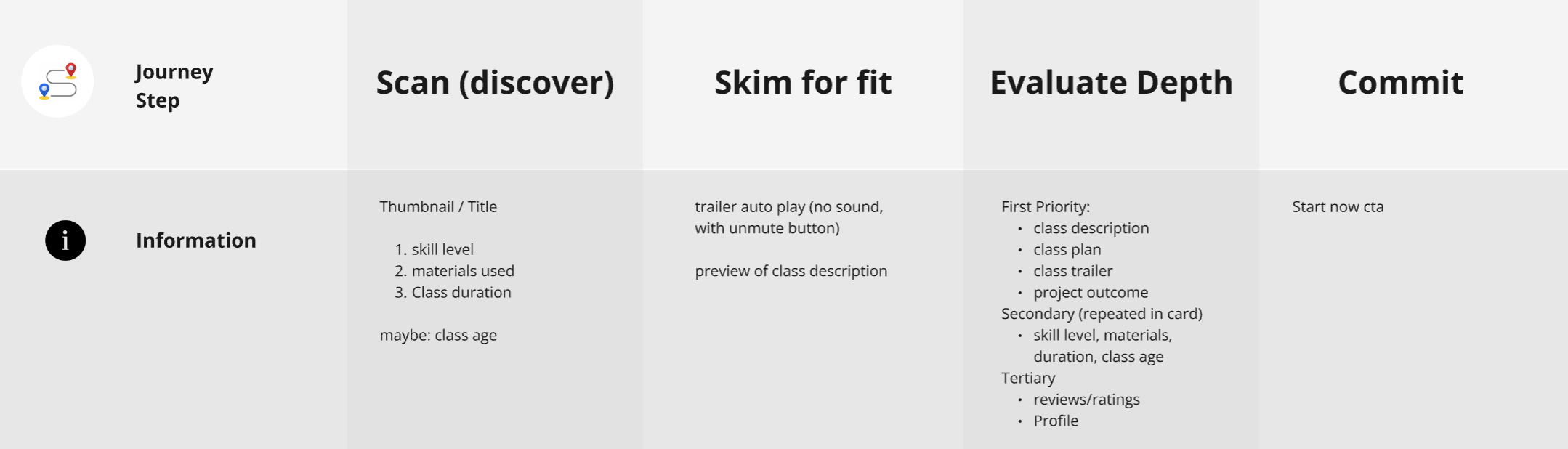
Across past and ongoing interviews, we heard a consistent mental model: users scan, skim for fit, then evaluate before committing.
User Survey
To validate and prioritize needs, I ran a survey (n=2277) asking users to rank class details. Results confirmed what interviews suggested, and this was helpful in informational hieracrhcy
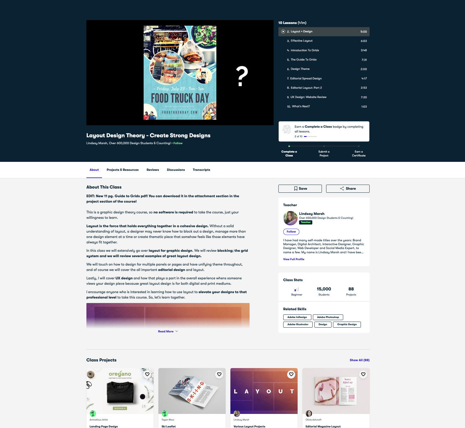
Design
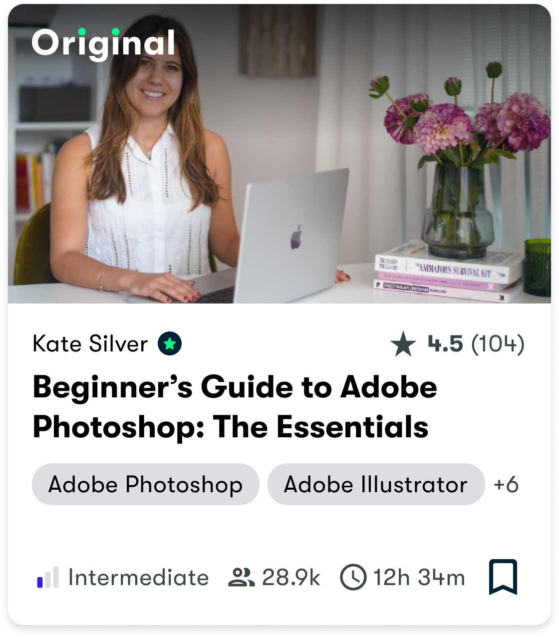
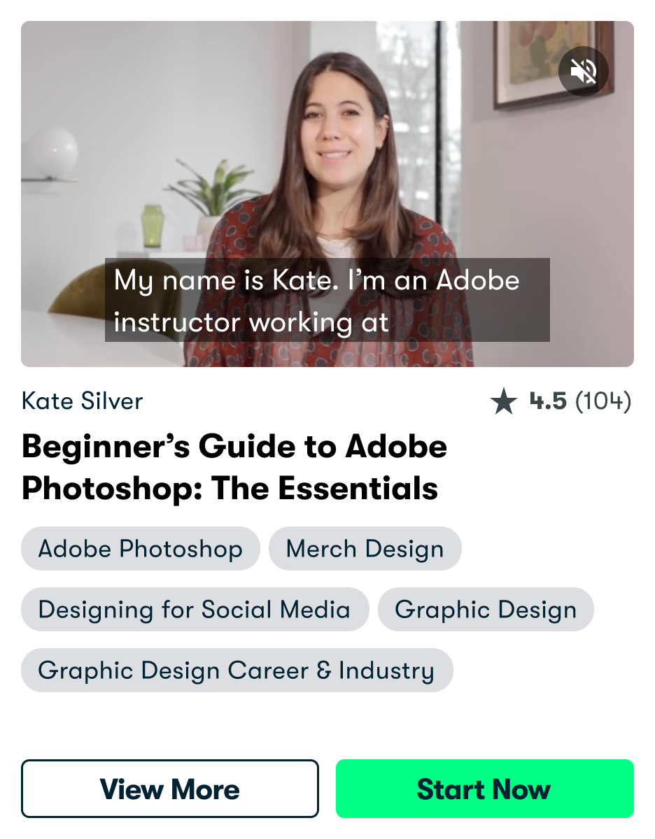
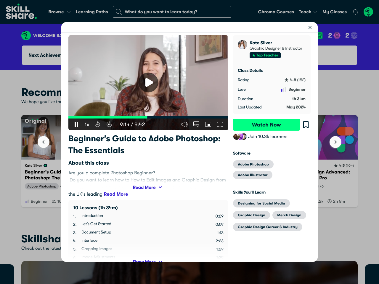
I redesigned the class discovery flow to better mirror how users think. Instead of forcing a jump from card to full class, We introduced a progressive model:
Card → Hover → Optional Modal → Class
Each step reveals deeper information aligned with what users need at that point in their decision.
Card → Hover → Optional Modal → Class
Each step reveals deeper information aligned with what users need at that point in their decision.
Usability Test and Final Changes
We tested the new flow using an unmoderated Maze study (n=183). Based on the results, I refined interaction timing, added Save/Bookmark functionality, and clarified CTA language.
Experiment -> Rolled out to 100% of users
After a successful A/B experiment, it is now rolled out to all users on the platform.


.png)