Timeline
Context
Project Type
Responsibilities
Jun 2022 ~ Sep 2022
UX/UI Passion Project
UX, UI
Product Design
Identity
UI/UX design
Competitive Analysis
SUS Test
Card sorting
Brand Identity
problem
There are too many things to consider when planning a trip, and the experience is inefficient.
Say you have a trip in two weeks. You list all the places you want to visit. Then, you arrange what day you’ll visit certain places. You check the transportation, how close each location is, and make sure it’s not raining on the day you go to the theme park. Lastly, you have to create a packing list according to the weather. And almost forgot to mention – you also have to manage the budget! 
Identifying the Problem
User Interviews
I asked 8 people in the age of 18~24 to find out what pain points they have when planning a trip.
I browse, go on the map app, browse, go on the map app many times when planning.
I don’t know what to pack the day before the trip.
I sometimes forget to check the weather and I need to change my plans the day of.
What did I learn?
01
All participants used an average of 3+ apps to browse, schedule, and manage budget.
02
The average number of trips they have planned independently from their family was 2.
03
Creating the route and timeline takes the longest during the trip planning process.
04
Some participants don’t plan meticulously, and they just book flights and hotels.
What are competitors doing to solve these problems?
I conducted a competitive analysis to identify competitor's strengths and weaknesses to inform Wanderlust's features and information structure.
How might we reduce young adults’ stress of using multiple platforms when planning a trip?
Understanding the Users
Persona
Scenarios
Testing + Improvements
Initial Wireframes
I conducted a remote usability test with 5 people to determine what improvements could be made and identify new ideas to satisfy user expectations, needs, and desires.
Using the System Usability Scale (SUS), I discovered that my product's average SUS was 71.5, which was just couple points above the acceptable usability score (acceptable SUS is roughly over 70, and SUS score of 71.1 – 72.5 is a C+). The usability was okay, but the Net Promoter Score (NPS) was classified as Passive. I wanted to improve the usability so the NPS was classified as Promoter (SUS score over 80).
Feature Priority Matrix
After the usability test, I realized I needed to make significant changes to the information architecture in order for the product to be comprehensive. 
Since traveling requires to consider a LOT OF aspects, the prototype I tested involved a lot of features. 

To better prioritize the features, I created a Feature Priority Matrix. This helped me in my iteration process.
Iterations
Based on the usability test and card sorting, appropriate iterations were made to enhance the experience of the users.
1. Changing up the information architecture
  • The original information architecture was complex, and there were repetitive information that confused the users.
  • Instead of having 4 main pages (Explore, Travel, Saved, Profile), I reduced it to three (Explore, Travel, Saved), and made the Profile section an overlay.
⬅ Before
After ⮕
2. Giving users more freedom
  • Although the original explore feed design allows the users to focus on each individual content, in a case of a travel app, users want to view places like a gallery and choose where they want to go -- like a shopping cart.
  • I also received feedback from the usability test that the explore page was a bit cumbersome.
  • In my iterated design, I created a layout so that users can view multiple places at once.
stores near me iteration
3. Minimizing necessary actions
  • Before, the users had to click on each individual day to access the day's schedule, and had to click to return back to access other days.
  • Addition of a date navigation bar: For the goal of having fewer touches, I revised the design so that the users can access all the different days without having to return to a summary page.
daily recommended iteration
4. Prioritization of features
  • The positioning of the Packing List was the greatest design challenge in the whole process of building this product.
  • I received advice that the placement of a feature determines the importance of it.
  • The packing list was not a major feature in my design, but it was still important to include. Reflecting on when the feature was needed, I thought that it was only necessary before going on a trip.
  • Reframing the packing list to appear only when necessary: I placed the packing list button in the Upcoming Trip section, so that it only pops up before the trip begins.
  • Additionally, I changed the layout of the packing list so that it is more mobile friendly and organized.
Visual Design
Changing up the design style for a user-friendly experience
I wanted to maintain a friendly look in the product. Initially, I used 3d illustrations to evoke that feeling. However, I realized that was hindering the user's comprehension with the travel places. I eliminated all the 3d illustrations and replaced them with actual images of places.
Also, I kept the overall design simple and minimal so the design wouldn't hinder the users' experience with browsing for places they want to visit and planning their trip.
Solution
1. Explore Places
  • Browse places you want to visit based on categories!
  • Search where you want to visit using customizable filters that allows you to set category and budget.
2. Save places you want to visit into routes
  • Saved places are organized into cities.
  • You can view your saved items as "collections", which are optimized routes that are generated based on your saved places.
3. Add optimized routes to your travel schedule
  • Easily navigate your travel scheduler!
  • Add saved places and collections to your daily travel schedule
4. Auto-generated packing list!
  • Packing list pops up before you go on your trip.
  • Wanderlust generates an expected packing list based on the weather/days you are staying.
  • Add additional categories and items that you need to pack!
5. Share your trip with friends
  • Wanderlust allows you to share your trip with friends, so that you can collaborate on planning the trip.
Reflection
Takeaways
1. You’re never done iterating.

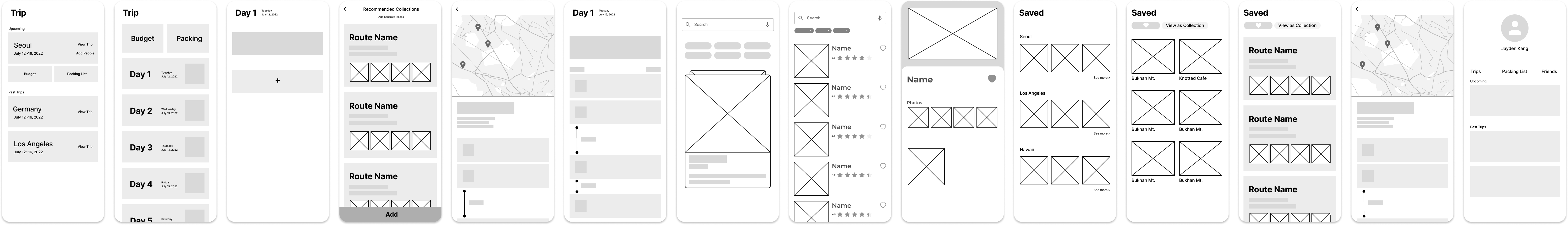
In the process of designing this app, I created 200+ wireframes. Iteration after iteration, I realized how my product’s usability improved through revisions. Usability tests and card sorting helped a lot when I was stuck on how to iterate my designs.

2. Prioritize features in the product’s UI.

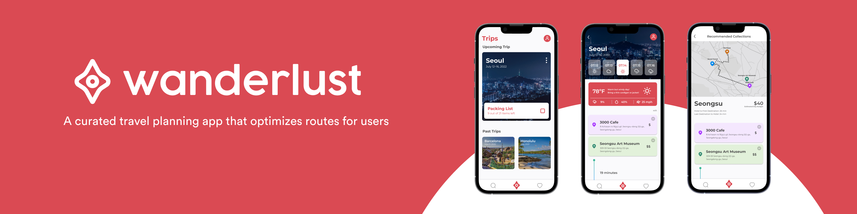
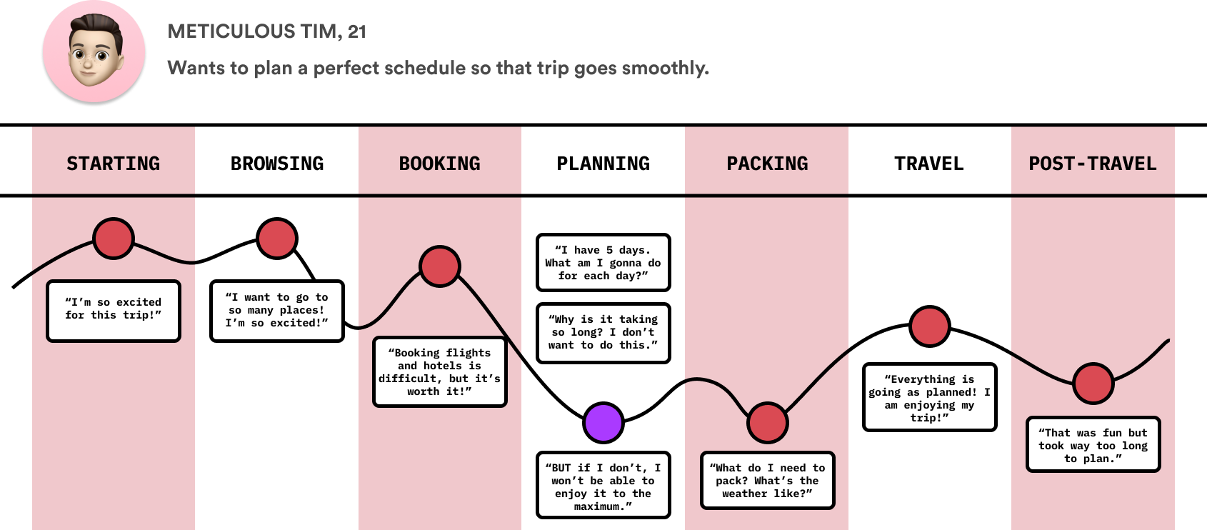
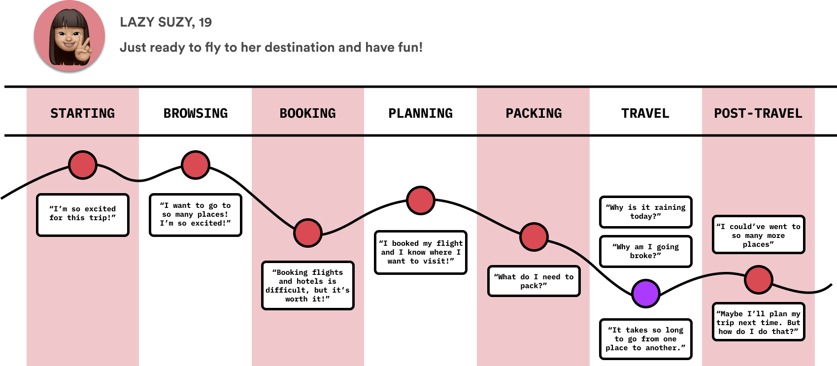
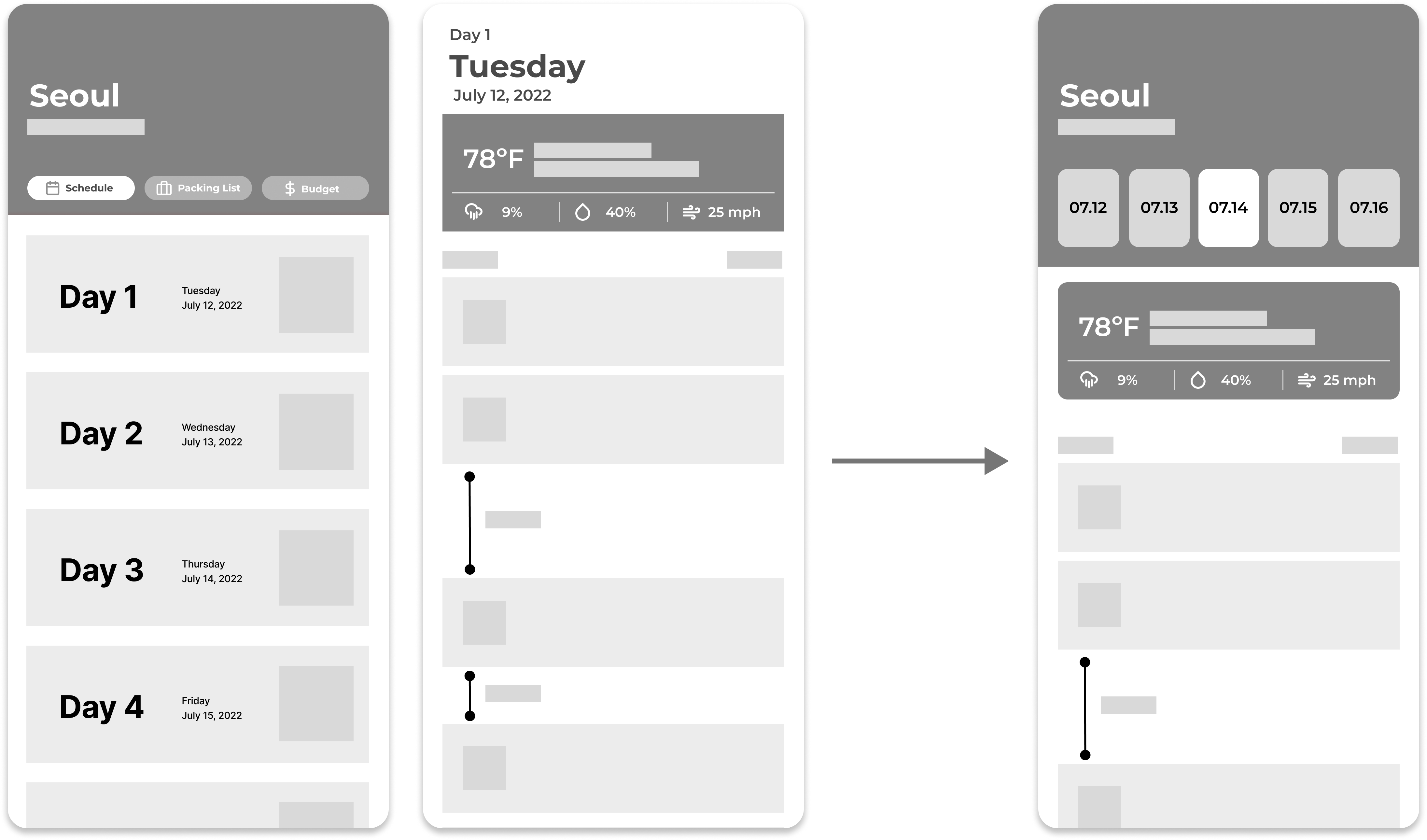
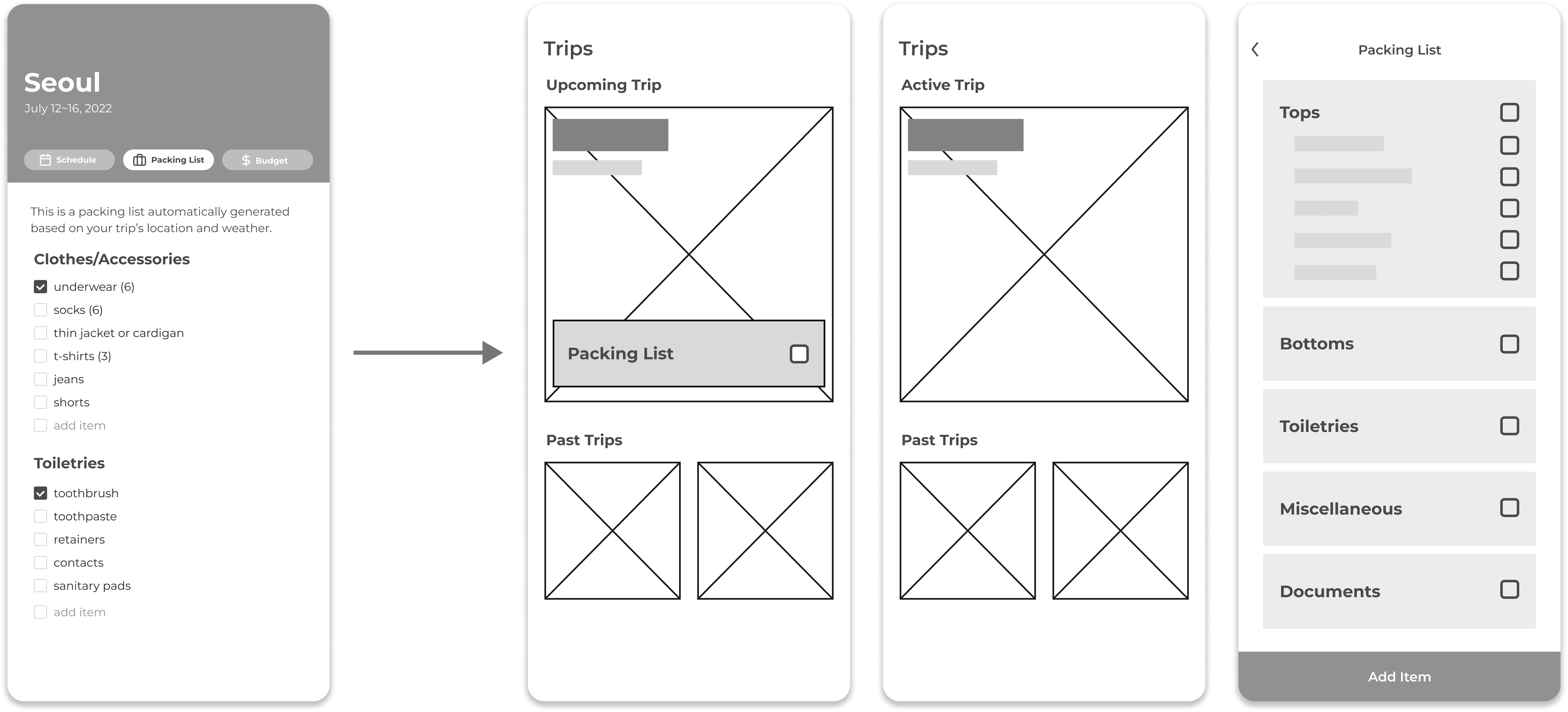
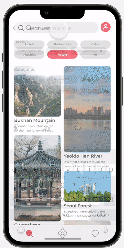
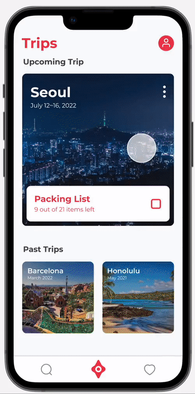
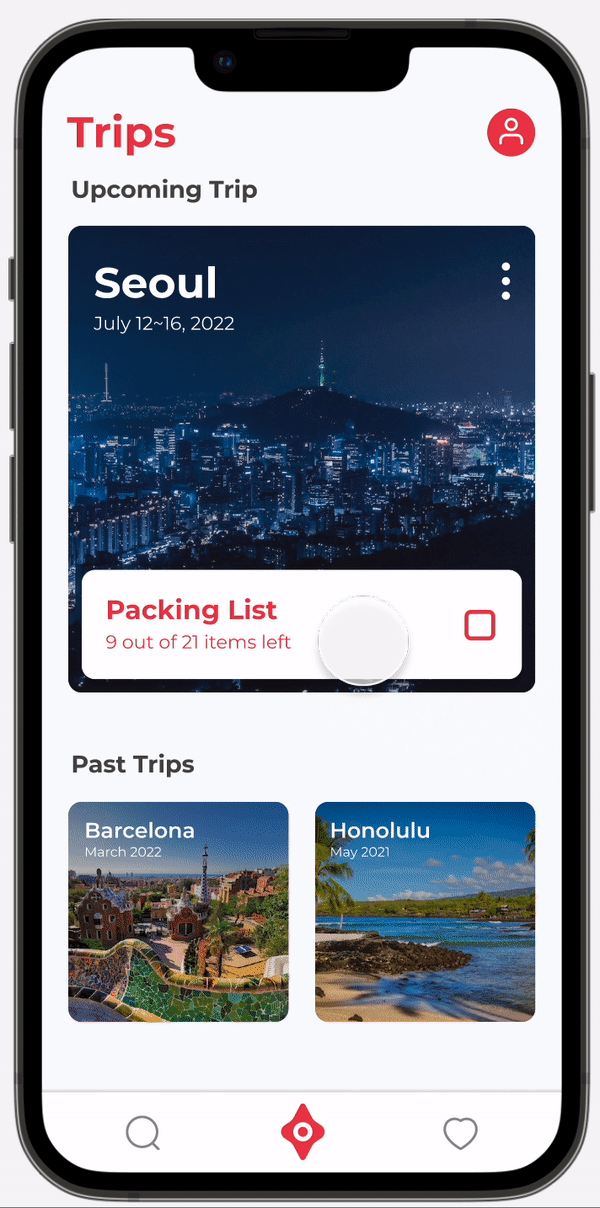
Wanderlust had a lot of information and features to be organized. What was most important to note was each feature’s priority. I learned this lesson when I was figuring out the placement of the Packing List. When I was asking around for advise, my classmate told me that I should think of the importance of the packing list. (For instance, if it has the importance to be a section on a nav bar or if it should be a small overlay.)
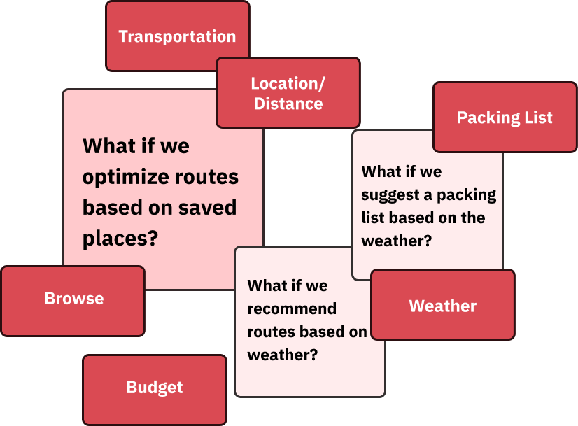
When positioning items, I need to think of when the users need the feature and how important it is.

3. Good design is invisible!

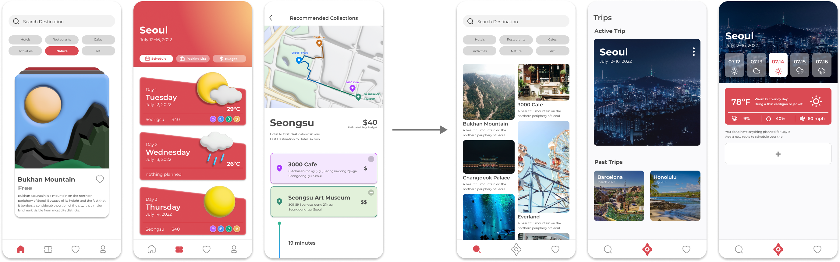
Initially, I incorporated 3D illustrations to my design so that the product looks playful and friendly. However, I realized that it was rather a distraction to the usability of the app. I changed the whole design system to be less decorative and minimal, so the users can focus on the content.

Future Steps

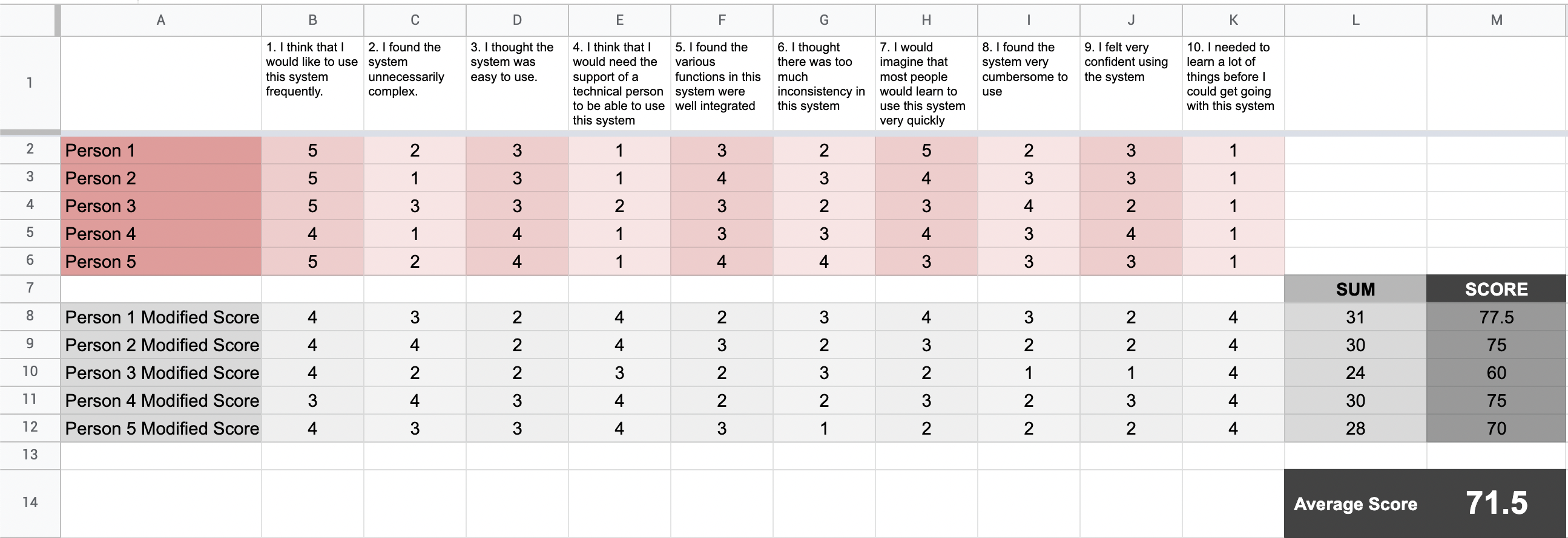
Building Wanderlust was a great opportunity to learn how to organize a lot of information into one product. It took me iterations after iterations to realize what I needed to value when organizing features. If possible, I want to conduct another usability test to check if the usability of my app improved, and if it reached my goal of being classified as a Promoter!